Glacier flow and surface analysis using remote sensing: at the intersection of different radar techniques
This article results from a study conducted by 30 first-year students during one week in the High Engineering School CentraleSupélec, part of the University Paris-Saclay. This project week follows a thematic sequence of courses on Earth Observation, existing since 2019 for 112 students.
The aim was to study several remote sensing techniques adapted to the cryosphere, for two glaciers, Petermann in Greenland, a polar glacier, and Kyagar in the Indian Himalaya, in the Karakoram region in Pakistan, a mountain glacier.
The students: Aude Banet, Matéo Bellouard, Vincent Benoit, Arthur Bernard, Paul Borne-Pons, Aurélien Canarelli, Marie Cedou, Hugo Chan-to-hing, Côme Charles, Raphaël Chieusse-Gerard, Nicolas Coffin, Romain Couchoud, Thomas Decultot, Marine Dufournet, Pierre Eberschweiler, Arthur Fardoulis, Damien Fouquet, Maëlle Garda, Paul-Emile Giacomelli, Marin Goxe, Tobias Guivarch, Baptiste Hoyau, Théo Kroon, Matieu Menoux, Julien Perrot, Rémi Rigal, Méline Ruel, Thomas Salton, Bruno Tabet, Felix Vandecastele.
The supervisors: Elise Colin Koeniguer (ONERA), Laurane Charrier (ONERA-LISTIC), Nathan Letheule (ONERA), Flora Weissgerber (ONERA)
Introduction
Observation of climate change is one of the major challenges of our generation, and the study of glacier evolution holds a key role in this process as their evolution is a direct consequence of global warming. The rising of the sea level is an economic issue as it implied the flooding of many inhabited lands. Moreover, glaciers can cause natural hazards. The failure of large amounts of ice may present a risk for navigation while glacial lake outburst flood can threaten the life of mountain populations. The melting of the ice also implies in the long term the emergence of new maritime traffic routes, which represent a major economic and geopolitical stake. Finally, glaciers are also one of our main resources of pure water on earth and their study can help to monitor our resources.
Several methods exist to study the cryosphere by remote sensing. However, cross-studies are scarce. The goal of this project is therefore to highlight what we can gather by comparing these different methods. More precisely, we combine these techniques to obtain information about glacier speed in combination with their ice state. We have studied each of the two glaciers separately by four different methods: polarimetry to determine dry and wet snow covers, optical flow to compute glacier velocity rates, interferometry to study temporal coherence and small displacements, and change detection by using the REACTIV (Rapid and EAsy Change detection in radar TIme-series by Variation coefficient) method.
After a brief presentation of the various techniques used, we summarize the significant results obtained for two glaciers: Petermann, an arctic glacier, and Kyagar, a mountain glacier, by using available open-data images from the Copernicus Program: Sentinel-1 and Sentinel-2 images, and open-source software.
The different investigated technics
Polarimetry to study dry and wet snow covers
There are two kinds of snow: wet snow and dry snow. Dry snow is composed of solid and gaseous molecules whereas wet snow is also partly composed of liquid water. This distinction is important because the presence of wet snow reveals a snowfall in the last few days or snowmelt. The polarimetry exploits the difference of scattering of the wave between wet and dry snow: the wave propagates into dry snow and its polarization changes, while it is reflected on wet snow.
Dual polarimetry allows to seperate wet from dry snows and infer the depth of snow. The index of dry snow relies on a change of polarization which occurs when the electromagnatic wave passes through the dry snow. This snow index (SI, in dB) is computed empirically as the positive increase of the cross-polarization over co-polarization ratio (σo vh/σo vv; in dB) along time. From this index, we can calculate the depth of the snow on the glacier. The snow depth SD (in m) is then directly proportional, in the absence of forest cover, to this index, according to [Lievens, 2019], with a proportionality coefficient a = 1.1 m/dB. For this computation, we have to find a reference master date. The reference image needs to have less snow as possible, so we can know the depth of snow.
[Nagler et al., 2016] allows the detection of wet snow, by assimilating it to a specular water surface. A combination of two linear ratios noted Rvv and Rvh which are the ratios between the reference image and the image of the day, in polarization VV and VH respectively, is used to obtain a single ratio R=W Rvv + (1-W) Rvh. W takes into account the incidence angles. According to the authors, if this ratio is less than -2dB then we have wet snow.
Optical flow
Dense Optical flow methods compute the deformation map between two images. The GeFolki algorithm [Plyer et al., 2015], allows computing a displacement map between two images of the same areas. Given the temporal baseline considered and the pixel size, this displacement map is converted from pixels into velocities.
The most important parameter to set in the Gefolki algorithm is the radius r which is a list of numbers and the number of pyramid levels L. For each number ri of the list r, the algorithm establishes correlations between the details of both images which are of size ri. The algorithm then does those correlations for each ri of the list r. If ri is too high, the correlations are too smooth. If ri is too low, the correlations are too sensitive to noise.
Interferometry
InSAR analysis (Interferometric SAR) is a technique that uses the combination in module and phase of two complex SAR images, acquired by two close antennas. The interferometric phase information contains both geometric information related to the relief, and to the very fine displacements (of the order of wavelength) that occurred between the two acquisition dates considered. This technique is complex to implement because it requires mastering both the principle of SAR image formation, corrections for tropospheric effects that may occur, and separation between terrain relief information and small displacements. The interferometric coherence information also provides information on the very fine changes that may occur in land surface topography between the two acquisition dates.
Change detection
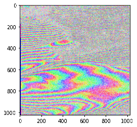
REACTIV (Rapid and EAsy Change detection in radar TIme-series by Variation coefficient) method is a change-visualization method applied to a SAR time-series [Colin Koeniguer et al., 2018]. REACTIV uses the colorimetric HSV space (Hue Saturation Value), to synthesize the information of changes within a time stack into a single colored image. Hue is linked to the date of maximum intensity. Saturation depends on the coefficient of variation, and Value encodes for the global intensity.
All these techniques have been applied to Sentinel-1 images, downloaded by using the Google Earth Engine platform on image subsets after projection to ground range and Terrain Correction, or by using Sentinel-Hub for the SLC products intended for interferometric processing. Sentinel-1 images are available on the glacier Petermann from 2017 in HH and HV modes, and on the glacier Kyagar from 2015 in VV and VH modes. The REACTIV method was applied using Google Earth Engine. Dry and wet snow indices were also coded on this platform. The interferograms were performed using SNAP software. GeFolki was used using Python. The QGIS software was used to perform post-processing.
The Petermann Glacier
Overall description
The Petermann Glacier is an outlet glacier located in the North of Greenland, close to the Nares strait (near latitude: 80.8 N, longitude: -60.9 E), and currently producing icebergs due to fractures. One of 251 square kilometers is opening right now. This glacier holds the largest ice tongue of the northern hemisphere and its evolution is one of the symbols of climate change. The glacier is in direct contact with relatively warm water and atmosphere, and modest temperature changes can destabilize the ice. Indeed, in 2010, a 251-km2 iceberg broke away from the glacier, the largest observed since 1962. Moreover, in 2016, Sentinel-2 allowed it to observe another massive crack that could soon lead to another iceberg of huge size calving off the coast.
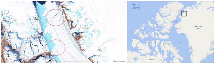
on EO Browser. The breaks circled in red are the fractures that we have used to measure the glacier’s evolution.
Snow
We have computed the wet and dry snow index on all the periods of observation (2017–01 to 2020–12), with 2019–08–14 as reference date, which corresponds to the driest period. The code compares all the other observations to this date to analyze the snow indices, and convert them to surfaces on each radar image. We obtain four graphs for each year that we analyze jointly with available average temperature, probability of daily precipitation, and average liquid-equivalent snowfall, in the closest meteorological station (100km)
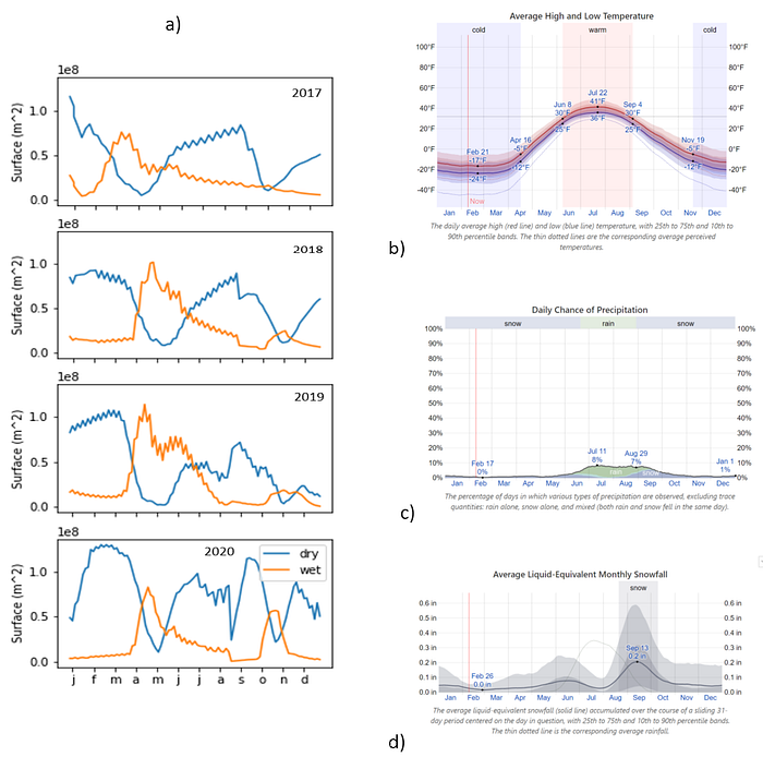
These graphs show an intra-annual tendency and correlations. When it snows or when the temperature is high, we detect wet snow because of snowmelt or the presence of fresh snow. Reciprocally, if it is a dry period, and the temperature is below zero, we will detect dry snow. From December to March, it is a dry period and snowfalls are rare. On the graph, we can observe a high dry snow index on these dates. Meanwhile, the wet curve is low which shows a low temperature in this period (average on this period: -25°C). From March to June, the dry snow index is falling and the wet snow index raises compared to the previous period, which corresponds to the snowfall period and a period of reheating. Then, the temperature backs down (from July), and a snowfall period starts in September. The snow, which falls quickly, freezes because of the temperature. From July to November, we can observe a peak of dry snow. Curves are similar between the years, except for a falling down of dry snow in 2020, August and a higher surface of wet snow in October, but we do not know if this observation is significant.
On the wet snow index images, we could also identify rifts on the glacier. Rifts usually contain liquid water that is detected like wet snow, and an important contribution of the double-bounce mechanism on rift walls might lead to a very high HH-polarization signal, which is also characteristic of wet snow.
An interesting point is also a parallel black band on each white band corresponding to a rift, linked to the general movement of the glacier during the period chosen to observe the wet-snow layer. Variation analysis of wet snow during March in different years reveals that snow surface remains globally the same between 2017 and 2020. Nonetheless, we identify rifts and especially central rifts in the length direction of the glacier. Between 2017 and 2020, two long rifts have appeared in the middle of the glacier.
Optical flow
Concerning the optical flow computation, one of the difficulties encountered is that the image footprint lies on two different UTM areas (EPSG=32620 and EPSG=32619) leading to split images during the export. We projected the “upper” image onto the basis EPSG=32620, using the function gdalwarp of the Python Gdal Library. However, We noticed that another artifact is still present in the upper part of the image, probably due to the terrain correction step.
We have applied the GeFolki algorithm by setting parameters radius R=[16,8], the scale parameter L=5, a number of iteration K=8, and a rank r=4.
We have estimated mean flow magnitudes on the glacier tongue between consecutive months. During the year 2020, the average speed is of 3m/day, roughly 1 km/year. We can see a rise of velocity from March to June, probably due to the high levels of precipitation according to the previous surface analysis. If the water resulting from snow melting reach the glacier bed, the friction forces between the glacier and the ground would be reduced.
Interferometry
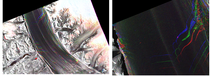
We have used SNAP to produce an interferogram from two images Sentinel 1 taken on January 3, 2020 and January 9, 2020, with the smallest possible temporal baseline.
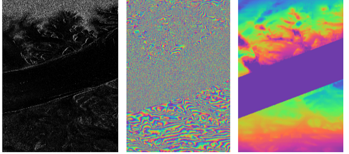
In the resulting interferometric phase image, interference fringes are visible at the top and bottom of the ice tongue. In the ice tongue, no fringes are visible, and coherence is very low in this area. We explain this lack of coherence by a fast-displacement of the ice tongue over time; whereas bedrock exhibits a high coherence, and fringes are visible. We use the plugin Snaphu to unwrap the phase. However, as the coherence is very low on the ice tongue, we are not sure of the success of unwrapping on this area between the upper and lower part of the image. For this reason, we have manually applied a mask on the glacier and considered the phase outside this area.
We compare it to altimetric data measures from 2013, as the classical Terrain data by SRTM are not available in this area. This enhanced resolution digital elevation model (DEM) was constructed by combining ASTER and SPOT 5 DEMs over the ice sheet periphery. The comparison between unwrapped interferometric phase and altimetry data seems to show that interferometric fringes are mostly due to the relief.
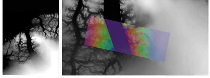
Unfortunately, we cannot properly analyze the interferometric fringes on the glacier tongue because of the large displacements on this area. As the velocity is estimated to 3m/day, the glacier moves from 18m within 6 days. We propose then to compute the interferometric coherence after compensating this movement by using a flow algorithm such as Gefolki. Given a master and a slave image, we compute the displacement between them, and we rewrapped the slave image on the master one according to this flow. We applied this processing to a set of 30 images of 1000x1000 pixels on the glacier tongue area, taken during one year in 2020, and coregistered using the orbital information by Pr. Jean-Marie Nicolas. The resulting animation shows that it is thus possible to retrieve information from interferometric fringes related to the finer displacements of the ice. Thus, this work shows that it is necessary to perform a different coregistration for the high-speed mobile zone (ice tongue) and the immobile terrain zone (bedrocks), to exploit the interferometric phase information, including on a high-speed mobile zone. On certain dates, the interferometric fringes remain too noisy. Our hypothesis is that episodes of snow lead to strong decorrelation, which is confirmed by the presence of snow on these dates.
Change detection using REACTIV
The REACTIV composition highlights intensity variations on the area of the various breaches on the glacier. To measure the speed of the glacier, we consider measuring distances between the different breaches. Looking at images from Sentinel 1, we can see three smaller breaches in the low-left corner of the area, and a big one in the top right corner. We will use the three smaller ones to compute the speed upstream of the glacier, and the larger one to compute the speed as well as the widening of this breach and its expansion perpendicularly to the global trajectory of the ice. The colored compositions make it possible to see that the fractures are not visible in the image for certain dates. Cross-analysis with snow index images and optical images shows that this is the case for periods when snow falls massively and covers the fractures in the glacier.
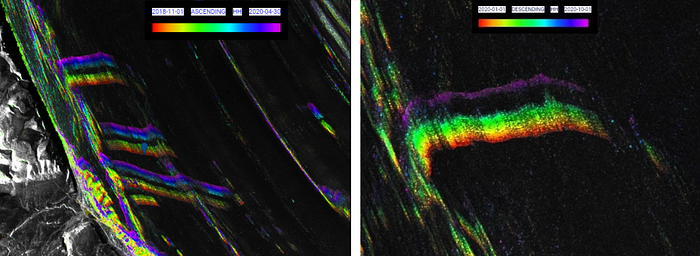
A big breach located downstream of the glacier seems to be opening more and more as the years go by.
Again, the heavy snowfall during the summer months results in significant discontinuities in the intensity profiles. Therefore, we have selected the dates corresponding to an absence of snow to continue the analysis, and proposed a classical RGB color composition by using three dates.
The various breaches that we have tracked to obtain the glacier’s speed have very similar speeds. However, the breach that is the most downstream of the glacier has a slightly higher speed than the others, as it moved further away from the rest of the fractures during the past year. It seems natural, as the speed must be higher near the lower parts of the glacier. Besides, we observed a nearly constant speed of the glacier averaged for each year from 2017 to 2020.
We also studied the expansion of some of the breaches. We thus calculated the angular opening of the fracture downstream of the glacier that increased in recent years and has seen its angle double between February 2019 and February 2020. The aperture angle is still increasing and was starting from 12° in February 2018 and reaching around 37° in January 2021. This very large breach is widening in length as well, as it now crosses a significant area of the ice. We measured the speed of lengthening of this fracture, which is approximately 668 m/year on average over the past 4 years (with an acute increase in 2018 and 2019). If the speed stays constant, the breach should be reaching the other border in approximately 2 years and a half. We also noticed a widening of the central break in the glacier (longitudinal). In certain places of the break, it reached 200m of width in November 2020, as it was only 173m in February 2019.
The Kyagar Glacier
Description
The mountain glacier Kyagar is located in the Chinese Karakoram Mountains and covers about 100 km2. It overlooks the Shaksgam valley, at the frontier between China, India, and Pakistan. It is a polythermal glacier spanning from 4800 to over 7000 m, consisting of three upper glacier tributaries 6–10 km in length which converge to form an 8 km long glacier tongue, approximately 1.5 km wide. This glacier plays a key role regarding the lake upstream from the river. During periods of glacier surge, there is a sudden increase of velocity for the glacier and an accumulation of snow and ice downstream of the glacier, leading to the formation and damming of a lake by the glacier, which may have played a major role in recent glacial lake outburst floods (GLOF) in the valley. These flood events can have devastating consequences on neighboring communities, causing casualties and heavy material damage on downstream communities along the Yarkant River in north-western China. However, this glacier is not very well studied, mostly due to the difficulty of field access (remoteness and political restrictions of access), which explains why most observations of the glacier are made through satellite remote sensing.
Snow cover
The snow index computed on our images reveals that there is more dry snow between December and June, while there is an increase in the amount of wet snow between June and September, which can be linked to the melting of the snow during summer.
We also observe that there is more wet snow in the valleys and cracks than on the summits and the glacier. Indeed, the temperatures are higher in the areas of higher curvature and lower altitude, so the snow melts easier and that is why there is more wet snow.
To analyze the evolution of average snow depth, we focused on two representative areas: one in the mountains (west of the glacier), the other north of the glacier near the glacier front; and we have computed the average snow thickness of each area for every month of the year 2018.
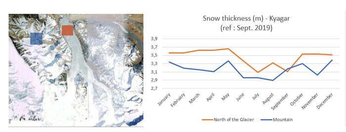
The evolution of the thickness of the snowpack on the Kyagar Glacier and on the mountains surrounding it in 2018.
The evolution of snow depth for the mountains is similar to those given for other mountains [Nagler, 2016]. The glacier also has the same behavior regarding snow depth variations during one year. Indeed, a part of the snowpack melts during the summer and during the rest of the year, the snowfalls regenerate it. We can also confirm that the snowpack is on average thicker in the glacier than in the mountains.
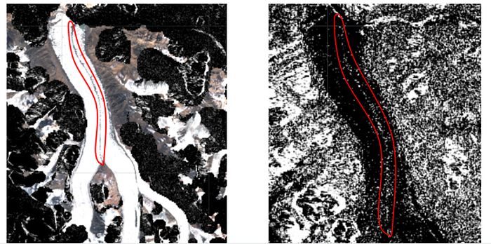
Very few optical data without clouds are available during this period. Although, on the optical images we obtained, we can see a dark line in the middle of the glacier as well as another one on the right part. We thus looked at this area with radar images and we found out that these lines are moraines, i.e. accumulations of unconsolidated debris that occur in glaciated regions, previously carried along by a glacier. It may consist of particles ranging in size from boulders down to gravel and sand, in a groundmass of thin clayey material sometimes called glacial flour. Because of its high albedo, the moraine heats the snow on it, which explains the prevalence of wet snow in this area detected during the winter. In our case, this is a medial moraine, which forms when two glaciers meet (here the west affluent and middle affluent), and debris is carried on top of the enlarged glacier.
Optical Flow
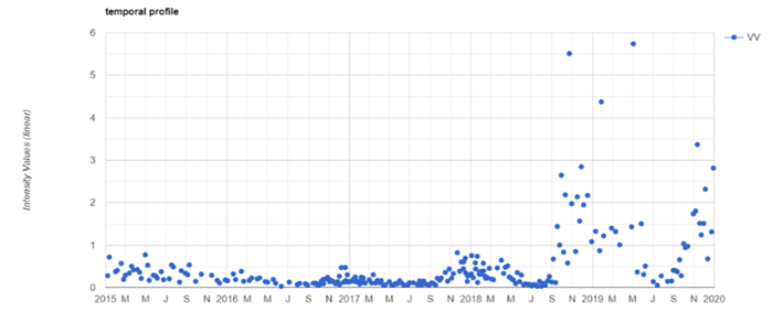
We have converted displacements into m/day from the result of the optical flow computed by GeFolki between 2015/02/24 and 2015/03/20. We can see a dominant movement on the glacier, a shift towards the north, due to a surge.
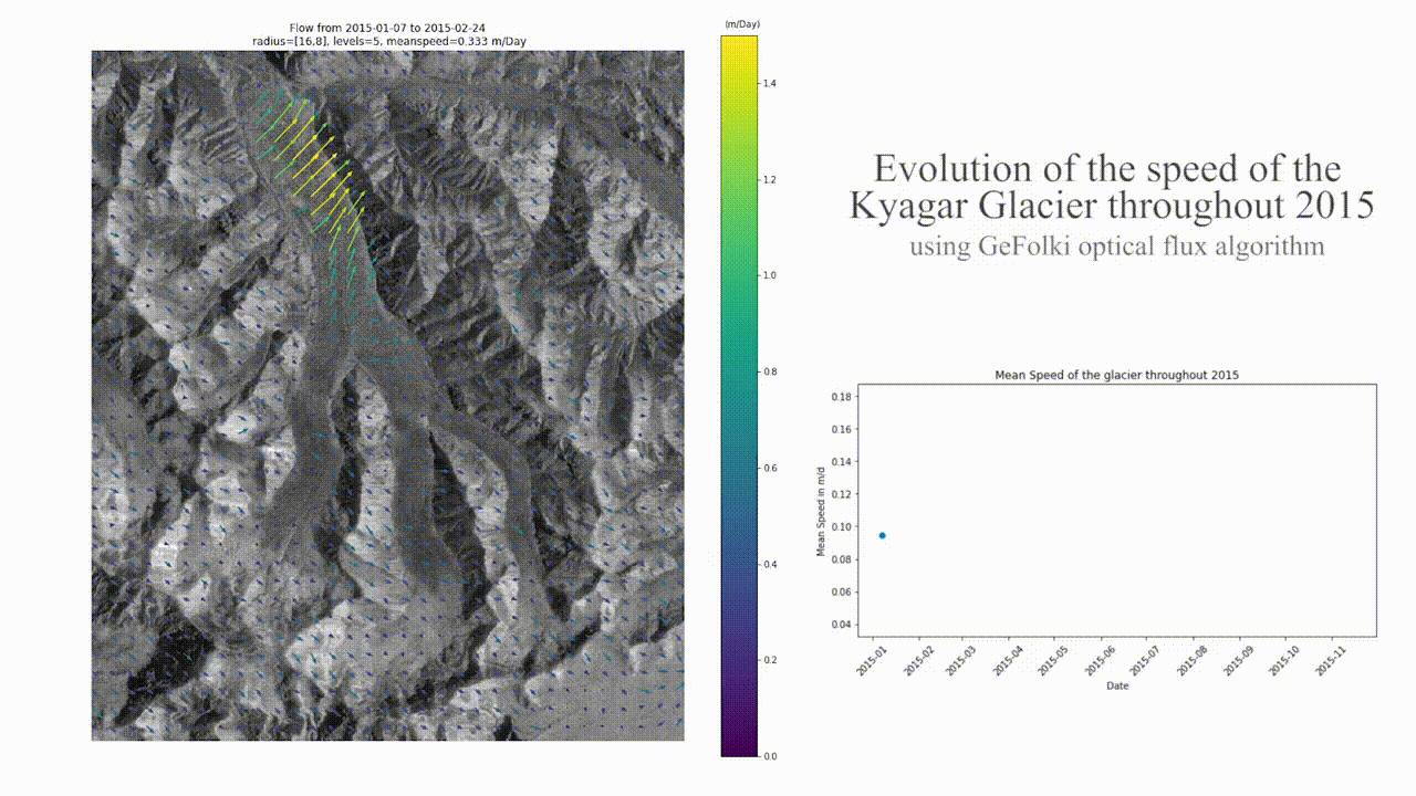
The values obtained are consistent with the results obtained by [Round et al., 2017]. We have represented the mean speed value, limited to the glacier extent by using a mask with QGIS, every month to describe the evolution of the glacier. This evolution of the mean speed of the glacier over 2015 shows a sharp increase in the first part of the year, followed by a slow decrease from April until the end of the year. The mean speed of the glacier is of the order of magnitude of 10 centimeters a day and reaches 18 cm/day betwen March and April 2015. This is one order of magnitude lower than the movement speed of the Petermann glacier.
The same method applied to compute the optical flow between 2018/02/02 and 2018/03/04 reveals that the instantaneous speed on the glacier is considerably lower than in 2015 (around 0.04 m/day in average over the year). Indeed the Kyagar glacier is a surge-type glacier: on the 2015 results, we witness the end of a surge that happened at the beginning of the year, where the speed of the glacier moved at velocities more than 10 times higher than normal. On the other hand, the 2018 results show lower velocities, and we could assume, based on the randomness of the directions, that the displacement computation is difficult when the glacier has barely moved between two close dates (here spacing 2 months).
Furthermore, we can notice an important change of surface in the bottom part of the image during the Summer of 2015. This difference might result in some artifacts in the bottom right corner of the image.
Interferometry
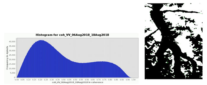
We have downloaded two Sentinel-1 images acquired in 08.05.2018 and 08.18.2018, already used to compute interferograms in [Zhang, 2020]. We have applied the interferometric process by using SNAP. We apply a GoldStein Filter to reduce interferometric phase noise, and then the terrain correction to geo-reference the different interferometric products.
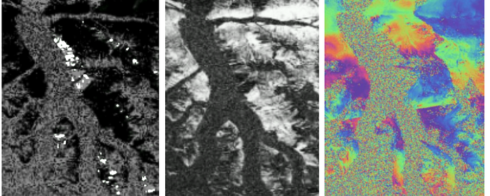
Unlike the results in[Zhang,2020], the interferometric fringes are only visible outside the glacier, where interferometric coherence is high enough. The coherence image exhibits a bimodal distribution: one corresponds to glaciers, the other one to free ice areas. For this reason, we propose to use the segmentation of the interferometric coherence to detect the glacier. Otsu’s method automatically defines a coherence threshold value.
Change detection
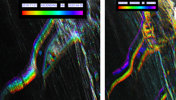
The Reactiv algorithm run over 2015, from January to December, lead to this image:
Red points are maxima of intensities acquired in January whereas pink points correspond to December. Hence, by measuring the distance between a red and a pink point in some spots of the ice tongue, we can estimate a mean distance of nearly 330 meters in the year, so about 90 cm per day. This does not correspond to the mean speed of the glacier but only a local one on the biggest spots.
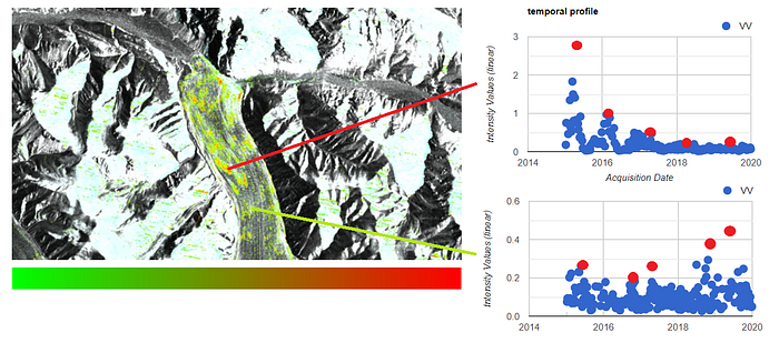
On the representation of the change between April 2017 and November 2017 using REACTIV method, at the edge of the Kyagar glacier, we can see a red signal meaning that the maximum of intensity corresponds to the beginning of 2017. We will then refer to it as zone A. We checked the optical image of April 2017; it appeared this red signal was not due to a part of the glacier but to a frozen part of the lake. To have more information about this zone we used the REACTIV code to make the temporal profile of the intensity of zone A, allowing us to know when this part of the lake was frozen.
The peak in the intensity profile in 2017 highlights the fact that during this period, a large proportion of the area was covered by ice. This implies the presence of a consequent body of water before winter 2017. This hypothesis is further confirmed by the extremely low value of intensity during Summer/Fall 2017, resulting from the high presence of water, which returns a low-intensity signal to the sensor. We assume that the lake became too big and broke the part of the glacier, which was retaining water, in other words, which creates a Glacier Lake Outburst Flood (GLOF). Optical images of July 2017 and July 2018 confirming that the lake has been drained.

REACTIV method also allows us to follow more precisely the draining of the lake. To do so, we extend our period of observation up to the end of 2018. The REACTIV analysis shows a blue/purple zone — named zone B — at the bottom of the glacier, demonstrating an important change in 2018.
Optical images do not allow us to understand what happened. Our theory is that the water made its way into the glacier, forming a trench. Looking at a recent optical image (the most recent available as of today’s date, January 27, 2021), this trench is visible.
To determine the date of the outburst we checked the temporal profile of the intensity of this zone.
Liquid water is what implies the lowest intensity in our case, thus before September 2017, the trench was full of water. We assume that there was a small amount of liquid water running into the trench. Between September 2017 and September 2018, the situation seems to be “back to normal”. After September 2018, the trench seemed to be dry or frozen as the intensity averagely skyrocketed (the seasonal decrease can be explained by snow and ice melt every summer.) We conclude that the REACTIV method allowed us to observe and determine the dates of the formation and disappearance of a lake. Thanks to Google Earth, we were able to make a time-lapse of the glacier from 1984 to 2018. This video shows that the glacier regularly creates a natural dam forming a lake.
Our last work was to propose another visualization method to monitor the evolution of the state of the glacier to see whether it is melting or not. To achieve such a goal, we considered a new index, taking into consideration the global evolution from year to year. To compute this index, we consider the 5 maxima obtained for the 5 years from 2015 to 2020.
The index looks at how much the maximum intensity, can undergo a strong decrease: i=m/max where m is the mean of the maxima over the years, and max is the global maximum over the years. In the HSV space, the hue is coded by this index: color is green when the ice did not melt (high index), whereas it is red when the ice melted a lot (low index).
Conclusion
Our studies carried out on Petermann and Kyagar glaciers have revealed many points:
- the estimation of glacier travel velocity, by REACTIV or Gefolki, allows to study seasonal changes in ice velocities or surge event in the case of Kyagar glacier. Velocity is about 3m/day for the Petermann glacier in Greenland; it is up to 90 cm/day in 2015 on Kyagar, and decreases after 2015.
- the monitoring of snow events using polarimetric information is in accordance with meteorological data,
- the GLOF (Glacier Lake Outburst Flood) of Kyagar can be monitored using REACTIV,
- it is possible to obtain interferometric fringes both with a classical coregistration method on weakly mobile areas and with “speckle tracking” (Gefolki) on areas that move very fast. However, the phase remains very difficult to use during snow episodes,
- The REACTIV method can be useful for:
* monitoring fault formation and their extension to Greenland
* interpreting complex dynamic developments, but with the need to propose alternatives more adapted to seasonal effects.
We warmly thank Pr. Jean-Marie Nicolas for the preparation of the interferometric time-series on the Petermann Glacier. We thank ESA and RUS-Copernicus (CS-Group) for the virtual machine services.
Bibliography
REACTIV:
https://medium.com/sentinel-hub/reactiv-implementation-for-sentinel-hub-custom-scripts-platform-10aa65fd9c26
GEFOLKI:
https://github.com/aplyer/gefolki
Lievens, H., Demuzere, M., Marshall, H. P., Reichle, R. H., Brucker, L., Brangers, I., … & De Lannoy, G. J. (2019). Snow depth variability in the Northern Hemisphere mountains observed from space. Nature communications, 10(1), 1–12.
Nagler, T., Rott, H., Ripper, E., Bippus, G., & Hetzenecker, M. (2016). Advancements for snowmelt monitoring by means of sentinel-1 SAR. Remote Sensing, 8(4), 348.
https://fr.weatherspark.com/ The typical weather anywhere on earth.
https://earthobservatory.nasa.gov/images/90043/new-rift-on-petermann-glacier, NASA Earth Observatory
Round, V., Leinss, S., Huss, M., Haemmig, C., & Hajnsek, I. (2017). Surge dynamics and lake outbursts of Kyagar Glacier, Karakoram. The Cryosphere, 11(2), 723–739.
Yin, B., Zeng, J., Zhang, Y., Huai, B., & Wang, Y. (2019). Recent Kyagar glacier lake outburst flood frequency in Chinese Karakoram unprecedented over the last two centuries. Natural Hazards, 95(3), 877–881.
Zhang, M., Chen, F., Tian, B., Liang, D., & Yang, A. (2020). Characterization of Kyagar Glacier and Lake Outburst Floods in 2018 Based on Time-Series Sentinel-1A Data. Water, 12(1), 184.
Plyer, A., Colin-Koeniguer, E., & Weissgerber, F. (2015). A new coregistration algorithm for recent applications on urban SAR images. IEEE Geoscience and Remote Sensing Letters, 12(11), 2198–2202.
Koeniguer, E., Nicolas, J. M., Pinel-Puyssegur, B., Lagrange, J. M., & Janez, F. (2018). Visualisation des changements sur séries temporelles radar: méthode REACTIV évaluée à l’échelle mondiale sous Google Earth Engine. Revue Française de Photogrammétrie et de Télédétection, (217–218), 99–108.
